

Few Sizes That Fit Majority of User Screens
Instead of the one size fit all solution, responsive layout enables designers and developers to follow the 80/20 by focusing on few target screen-size that serve most of their audience.
Users went visit the our websites will mostly use either a mobile device, an ipad or a personal computer. So we will need 3 to 5 different breakpoints in the our CSS.
Depending on time and capital budgeting as well as the complexity of the design, developers can choose to use an existing CSS framework like Bootstrap or writing their own custom CSS.
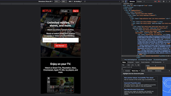
When writing our custom CSS for mobile device, we will most likely need to set breakpoints at 414px for the iPhone XR, 820px for the iPad Air and 1000px for larger iPad and Personal Computer.
References